The science behind Airbnb photos—and why some listings book faster
Most hosts assume guests browse Airbnb listings.
They don’t.
They scan—quickly, intuitively, and with one question in mind:
Does this look like a sure thing?
Guests are evaluating your photos
instantly and instinctively.
Before a guest reads your description, checks your amenities, or even looks closely at your reviews, they make a judgment based almost entirely on visual information. Research across hospitality and the sharing economy shows that photos aren’t just decorative—they’re the primary tool guests use to reduce uncertainty and decide whether to keep going or move on.
Let’s look at what the research actually tells us about how guests use photos—and what your listing images are communicating, whether you intend them to or not.
Guests aren’t just looking for beauty. They’re looking for certainty.
Short-term rental platforms like Airbnb suffer from what economists call information asymmetry: guests can’t walk through your space, touch the furniture, or test the bed before booking.
So they rely on signals—especially visual ones.
Multiple studies show that guests use listing photos to answer a small set of practical, risk-based questions:
Can I picture myself here?
Does this look clean and cared for?
Is the layout clear, or am I guessing?
Will this feel easy—or like work?
Large-scale research analyzing Airbnb demand has found that certain types of images—particularly clear, well-composed interior photos of living spaces—significantly increase bookings, especially during high-stakes travel periods like holidays.
In plain terms:
Guests aren’t admiring your decor. They’re deciding whether booking this feels low-risk. (Yes, your decor does matter. But that’s another blog!)
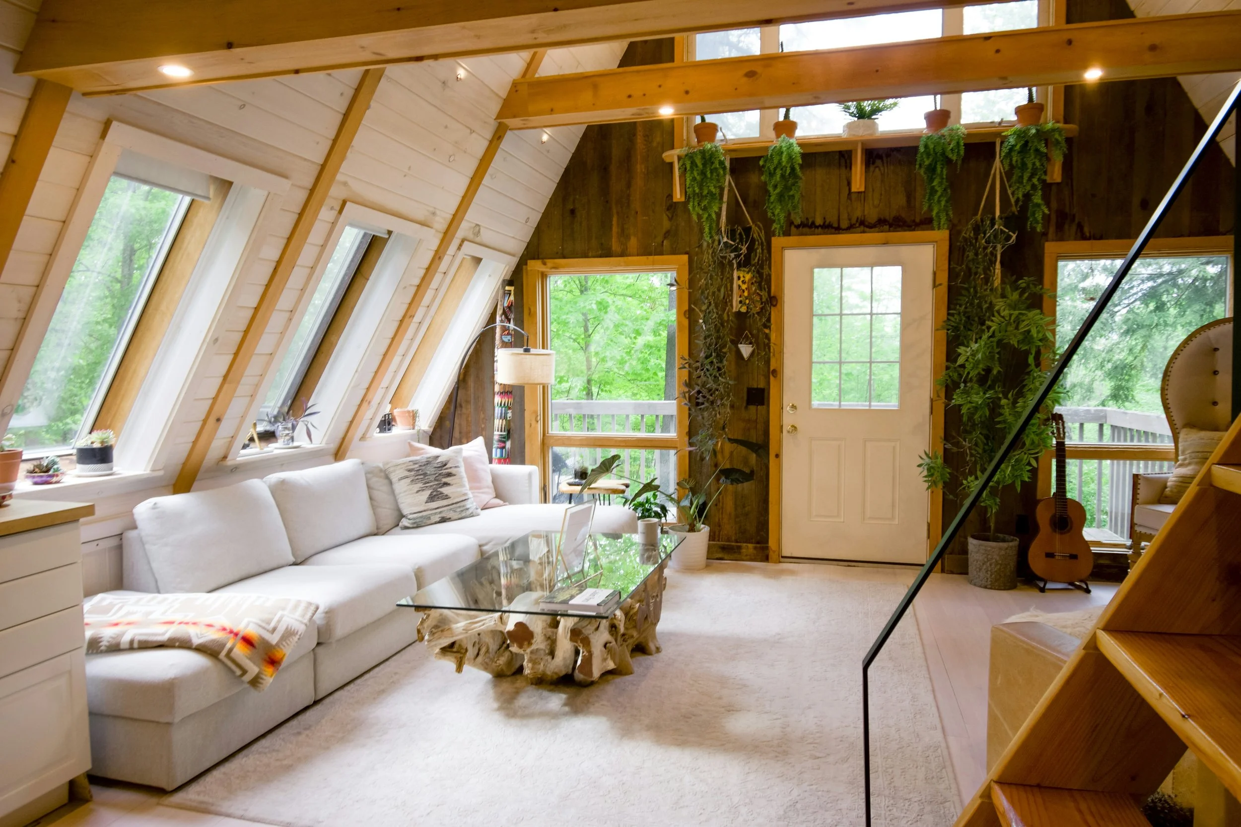
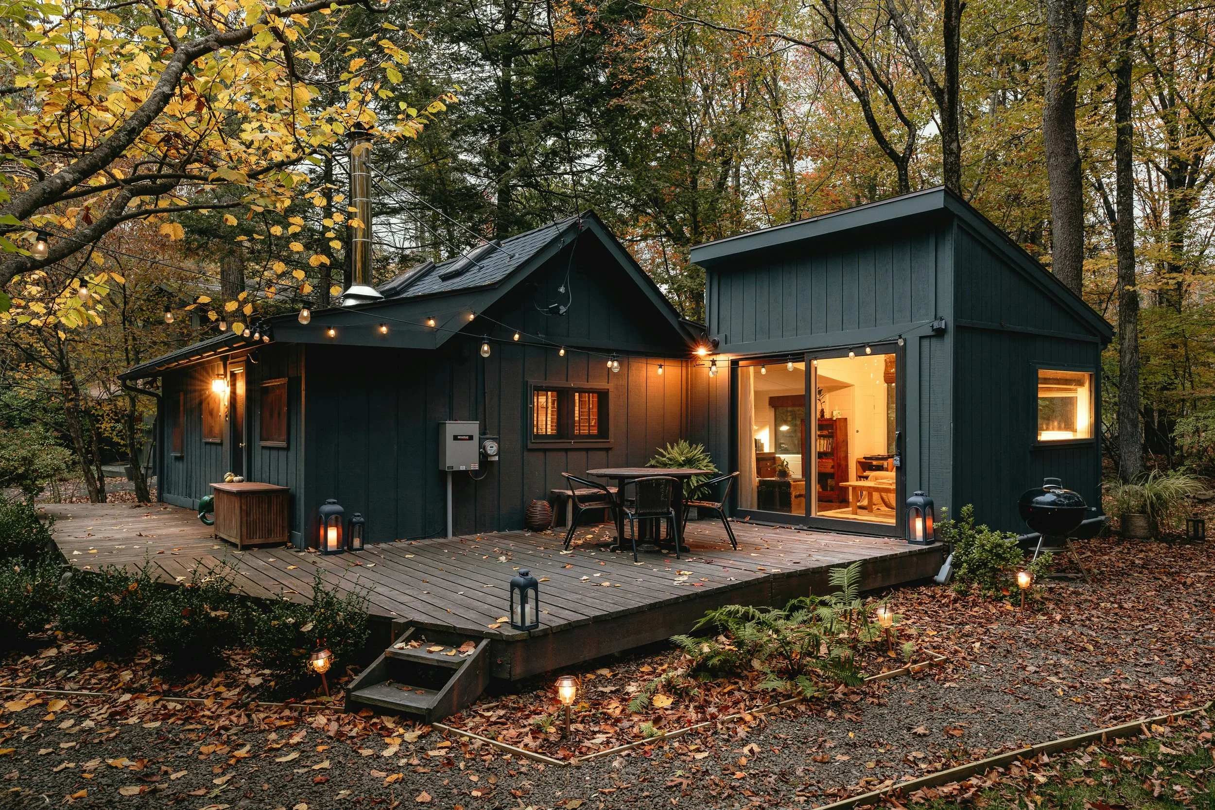
Your cover photo should be a
well-designed living room.
The cover photo is a filter, not a feature
Your cover photo has just one job.
Convince the guest to click.
Research on visual framing and first impressions in hospitality consistently shows that early exposure to a single image strongly influences whether users continue exploring or disengage entirely.
That means your cover photo should do three things—fast:
Clearly signal what kind of stay this is (entire home, cozy cabin, modern apartment)
Show a space guests can imagine themselves using
Reduce ambiguity about layout, light, and comfort
What this means in practice
For most entire-home listings:
✅ Use a living room or primary common space as your cover photo
⚠️ Avoid leading with bedrooms (they’re harder to read and less distinctive)
❌ Skip tight detail shots, moody lighting, or decorative vignettes as the first image
If a guest has to interpret your cover photo, you’ve already lost momentum.
Visual signals can matter as much as reviews
On Airbnb, reviews are often compressed—most listings sit between 4.6 and 5.0 stars.
When ratings cluster like this, guests look elsewhere to differentiate quality.
Research on trust and reputation in the sharing economy shows that visual cues step in when review scores stop being useful. Photos help guests infer professionalism, care, and reliability—even when reviews are nearly identical.
This is why:
Two listings with the same rating can perform very differently
Newer listings rely heavily on visual trust cues
“Professional-feeling” photos often outperform casual ones at similar price points
Guests aren’t consciously ranking you.
They’re feeling their way toward the least risky choice.
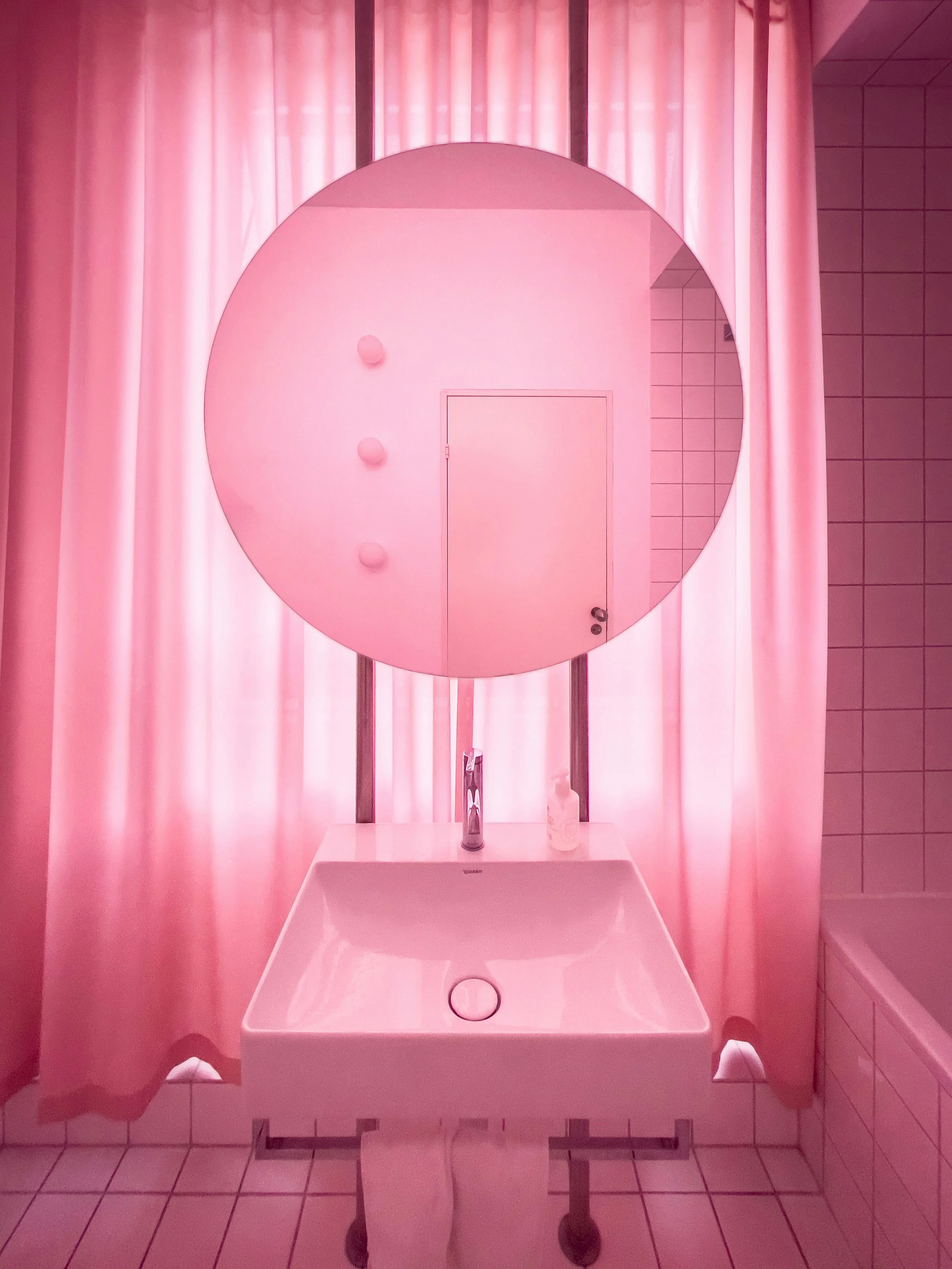
Bold design signals professionalism. Professionalism means low risk.
Why one “unexpected” design moment often works
There’s another pattern the research supports—and many experienced hosts recognize instinctively.
Listings that perform well often include one distinctive design element:
bold wallpaper
a statement light fixture
a mural or neon sign
a strong color moment
a visually striking vignette
This isn’t accidental.
Research on consumer perception and hospitality environments shows that distinctive design elements increase memorability and signal professionalism, especially in commercial spaces. When guests encounter a space with a clear, intentional design choice, they’re more likely to think:
This was planned.
This isn’t just someone’s spare bedroom.
This place will be consistent and well run.
In other words, distinctive design can function as a trust signal.
Why this works (and when it doesn’t)
Distinctive design works only when the basics are already solved.
If the space is:
clearly laid out
clean and well lit
easy to understand
Then a bold or surprising element reads as:
Confident. Intentional. Professional.
If those basics are missing, the same element can backfire—feeling distracting, gimmicky, or even risky.
This is why professionally designed listings tend to succeed with bolder choices:
they use one memorable moment, not visual chaos.
What the research is really saying
Across multiple studies, one theme keeps surfacing:
Guests make fast decisions using visuals to minimize risk.
Professional photos are non-negotiable.
Your photos are doing quiet but powerful work:
Signaling cleanliness
Signaling effort
Signaling ease
Signaling honesty
When they work, guests don’t notice.
When they fail, guests don’t always know why—they just move on.
A research-backed checklist: What your photos should do
Without changing your decor or spending thousands, your photos should:
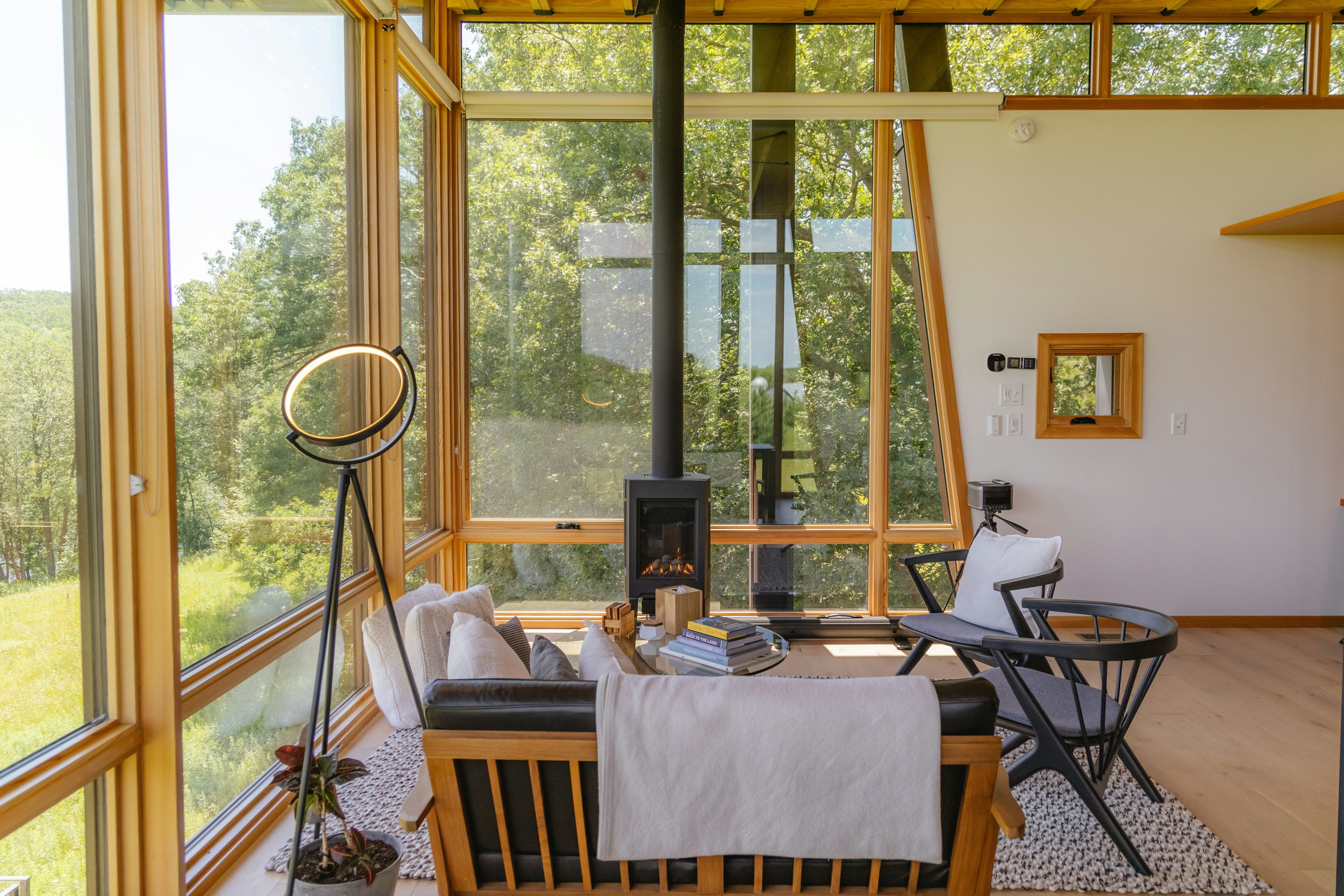
Show clear room boundaries and layouts
(Guests should immediately understand how the space works.)Use consistent, natural-leaning light
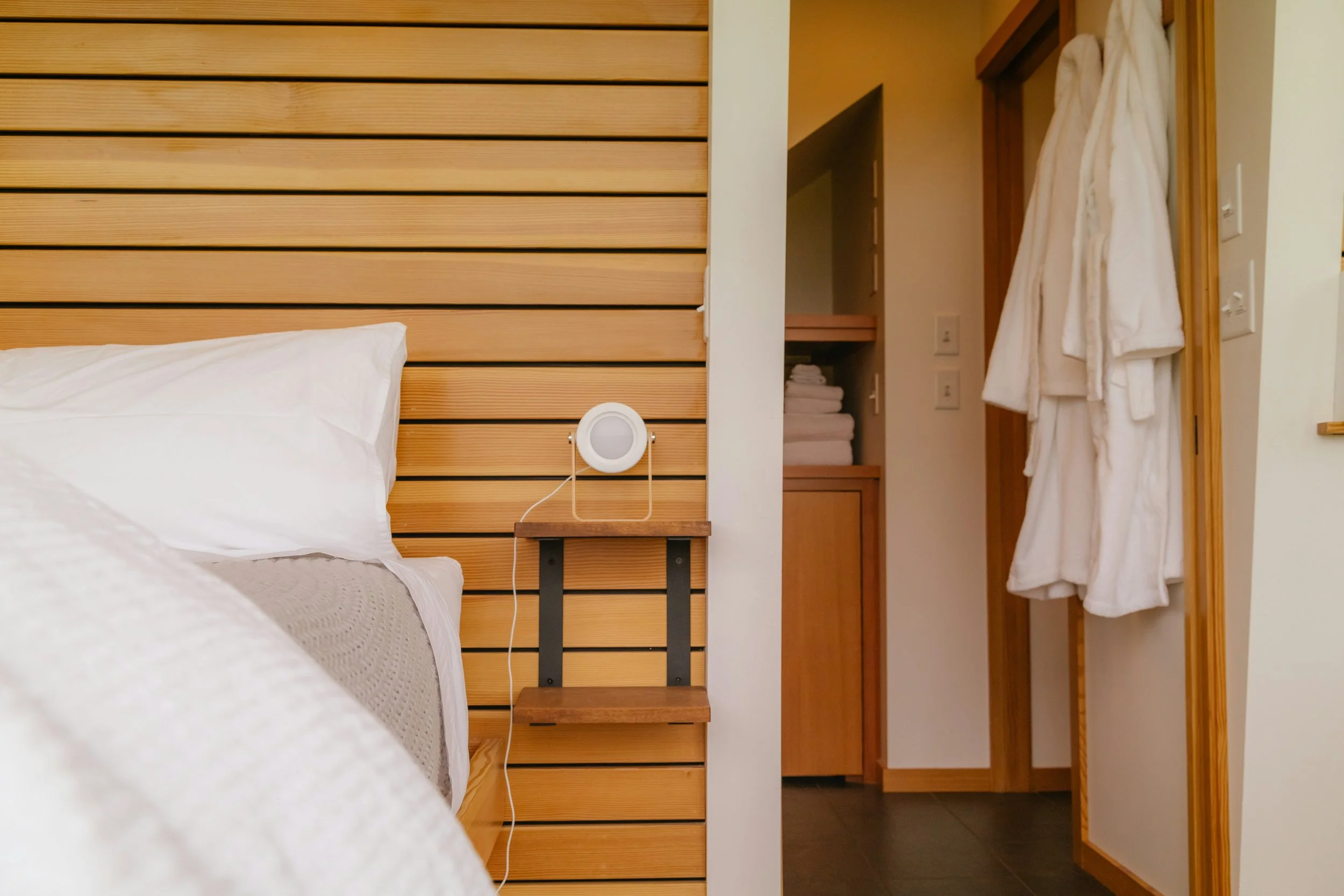
(Turn off overhead lights and open the curtains.)Feature spaces guests actively use, not just sleep in
(Living room > bedroom. Kitchen > hallway.)Remove visual clutter that signals effort or maintenance
(Fewer objects = easier stay.)Follow a logical visual flow
(Arrival → living → kitchen → bedrooms → bathrooms → extras.)
These aren’t design trends.
They’re responses to how guests actually make decisions.
The bottom line: See your listing like a guest
Hosts are emotionally close to their spaces.
Guests aren’t.
What is your photography communicating?
They’re making quick decisions with limited information, and research shows that photos are their first—and strongest—filter.
The goal isn’t better taste.
It’s clearer visual communication.
That’s the difference between a listing that looks good—and one that books.
Sable helps short-term rental hosts think more clearly about guest experience, design, and operations—using research-backed insights, not trends.